
The commercial posters or brand marks discussed below are reference examples, not presented as COLONFILM commissions. The commentary describes visual choices rather than measured campaign results.
Use these ten checks to review a movie poster you have already designed. The aim is to spot an unclear focal point, unreadable type or a visual promise that does not match the film before you approve the artwork.
Review the design at full size and as a small thumbnail. Ask someone unfamiliar with the film to name the title, likely genre and main subject. Record what they actually identify rather than asking only whether they like it. This is a practical design check, not proof that the poster will increase ticket sales.
Starting with a blank page? Follow the five-step movie poster workflow first. Comparing a character portrait with an ensemble or landscape concept? Use the poster-type guide.
Captures the subject of the film. Motivates the viewer.
There’s something essential when it comes to design movie posters and that’s to find the proper focus or motif. We must find the most appropriate way to faithfully represent the essence of the movie, considering the particular approach that we want and always considering the wishes of the audience that it’s intended. We can choose between different motives, either the main theme, the story, its characters or even the actor if he’s well-known or if he is loved for the public.
The motifs of the cinema listings is where the designer has a better margin to create, attract and to give a good reason to go to see the movie to those who are looking at it.
The use of the iconography it’s very useful when we want to incise to the motif of the poster to represent the movie. Somewhat minimalist. The iconography used to create movie listings, it captures us in just one symbol and with a simple image but at the same time it gives us a huge visual impact and captures the essence of the movie.
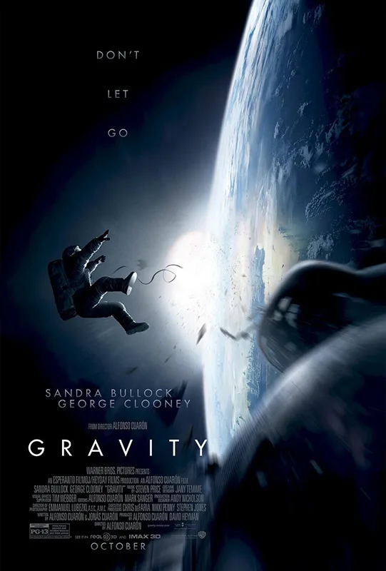
Poster of the movie Gravity where the main motif it’s a weightless astronaut floating in the space which it seems to be an effect of an explosion.
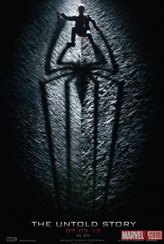
As we see, the main motif of the movie poster of Untold Story it’s a man projecting the form of a spider, a clear reference to Spiderman. A poster that they knew how to capture a darker image of a modern Spiderman, completly different from the typical poster of silver letters and a man with a blue and red tights.
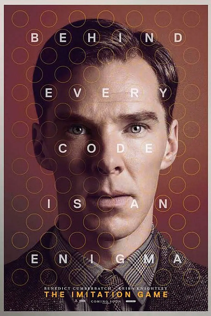
On this poster of the movie The Imitation Game the main motif it’s without any doubt, him, Benedict Cumberbatch, one of the most famous actors in the recent times. They used his charismatic image as the main motif of the poster to attract his audience. How Sherlock will do it on this movie? To appeal the image of the actor it’s always a good decoy for the design of a movie poster. Moreover, in the poster of The Imitation Game we can also see that there’s a subtile reference to coding thanks to the distribution of the letters, that it’s the main theme of the movie.
It sends a clear communicative message.
A well designed movie poster or an effective billboard must be able to inform and to entertain at the same time. The function of a movie poster is to connect with the audience that it’s intended, to draw their attention, but especially it has to capture the essence of the film. The future viewer has to decide in a couple of seconds if it’s of his/her interest or not. The design of the movie poster must to show a clear and easy message for the audience that it’s intended.
This is the job of the poster designer. To know what he/she wants to communicate and to transmitted it through the image, colors and forms. Just as there are different types of film, there’s also different types of message. Even a same movie could transmit different messages depending on the design that we’ll use for its billboard.
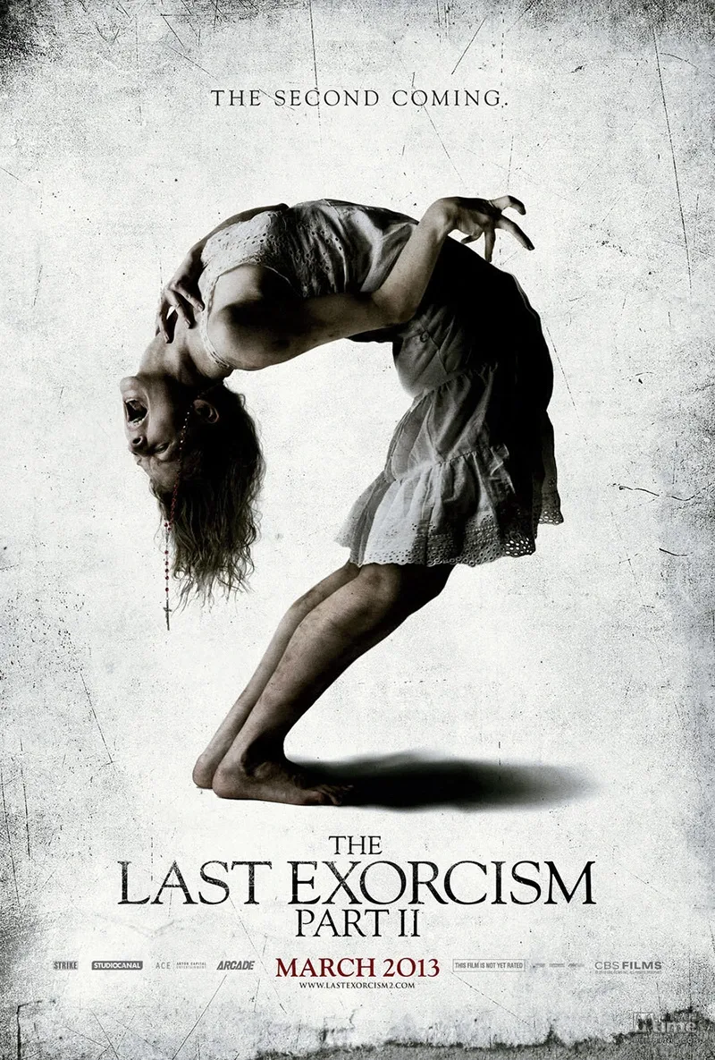
This poster it’s a good example of a clear message and an effective decoy. The message of the second part of The Last Exorcism does not lead to any doubt, a terror movie about exorcisms. An effective movie poster that will attract to those who appreciate this genre, and even more, to those who loves the first part of the movie.
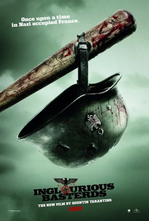
The movie poster of Inglourious Basterds it also shows a clear message. A baseball bat holding a nazi helmet in a suggestive way. They could have used the decoy of its protagonist, Brad Pitt, like we saw in other movie posters, but in this case they have chosen a simple motif and a communicative message. The name of Tarantino had to appear on this movie poster. Is there any better decoy than his name?
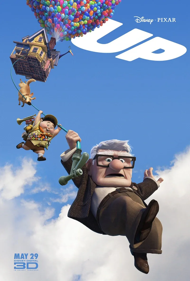
In the billboard of the movie UP by Pixar they also send a clear message. A grandpa, a kid, a dog and a flying house attached to balloons. There is no doubt. Adventures, entertainment and a movie for the whole family.
Create a design that will make your movie poster unique
We’ll pay attention to the different key elements when we’ll start to design the poster. At this stage is where we have to faithfully capture the essence of the movie. We must to transmit sensations, to arouse interest and to intrigue the audience.
The color is one of the main elements to consider. Colorful? White and black? Chromatic? Based on the contrast? We have to choose. The same personality of the movie will help us with the poster design. We don’t use the same composition in a billboard of a drama than a billboard of a comedy. The color of the poster transmits immediate sensations. Seriousness, passion, calm, intrigue, fun, fear…
A palette's effect depends on imagery, contrast, genre conventions and the viewer's context; a color does not carry one guaranteed meaning.
Compare palette alternatives with the film's themes and ask viewers what tone they expect before explaining the intended answer.
On the other side, the contrast is also a great ally in the design of the movie poster. At the same time, the collision of the colors along with the easiness and simplicity that transmite do not leave anyone indifferent. Through the contrast we can intensify a lot the message of the movie along with the different light variations.
Continuing with the phase of the movie poster design, we arrive into the phase where we’ll choose its composition. We’ll decide what will appear on the image of the billboard and what not. Creativity and easiness. A lot of times, more is less, and we can achieve the interest of the viewers with something subtle or iconic, instead of using something complicated. Sometimes complexity can end up being incomprehensible.
The composition of the poster is completely related with the motif and the message of the movie or with the ambitions of the filmmaker or the graphic designer, depending on who has the last word on the project.
And finally the details. The cherry of the cake. The small things of life are more determinants that what it seems at first sight and the details of the design of the movie poster too. In the details is where the designer can play with some references of the movie or he/she can improve the central motif of the design or even give it a better finish. It’s essential to know if we want a detailed work or contrary we want to create something a little more minimalist. In many occasions, more than the designer it’s the movie itself who decides.
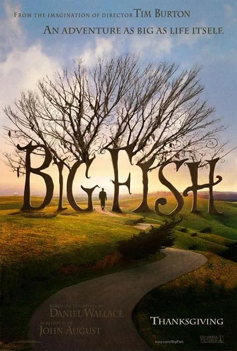
The movie poster of Big Fish it’s a perfect design for this Tim Burton’s delusional fantasy film. Playing with vivid colors, a beautiful landscape, the central motif of a man and a great typography for its trees. An striking, creative and original design.
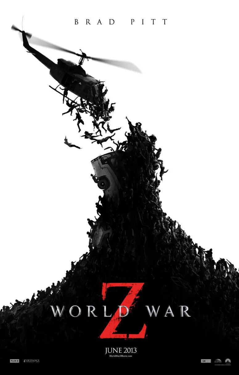
The design of the movie poster of World War Z is a good example of contrast and a central motif, a billboard that certifies the beauty of simplicity. The white and black poster with the highlighted red Z demonstrates drama and a certain point of tension and aggressiveness. The mountain of zombies trying to catch the helicopter leaves no doubt about the post apocalyptic world that shows the film.
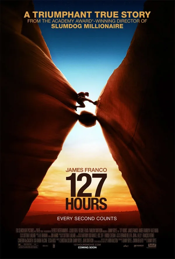
An attractive poster design of the movie 127 hours. The main motif of the rock-climber with a great chromatic game between the blue graduation of the sky and the orange brown tones of the mountains and the lower sky. The perspective focused towards the center, into the climber, denotes the risk of the image. A shocking design with a message that arouses interest.
Make a coherent and faithful design to the movie.
A fundamental thing in the design of any cinema listings. The motif of the poster, the message to be transmitted, its design and the movie, must to dance the same music and to follow the same compass. The coherence takes care of the colors and the light of the design to fit the climate of the movie. It determines that the focusing of the designer and the message conveyed is relevant for the audience and it’s related to the plot of the film. The coherence of the design grants to the movie poster the same pulchritude of a puzzle where all the pieces fits with naturalness and wit.
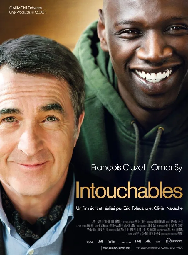
A perfect sample of coherence is the design of the movie poster of Intouchables where you can see the two main characters showing complicity but at the same time it shows a clear difference between them. To appeal the rational part, that is the subject of the film, without much more sophistication, is always a good technique.
The great communicative value of a good typography
The fond used for any kind of text it has more importance than we might think at first. The design of the letters, together with the other elements, it has the ability to significantly influence the whole atmosphere of the advertising design. Compare letterforms for readability, period and tone; no font shape is automatically right for every film in a genre.
A technique that is present in many billboards that has been successful is the technique to combine diverse typographies. A technique that offers creativity to the message and it also gives it a disruptive and very characteristic aspect.
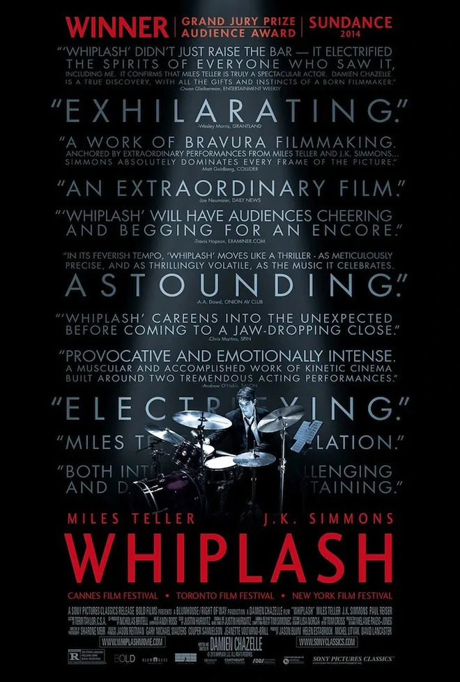
The movie poster of Whiplash. We can see that through diverse typographies and different sizes and colors they send us diverse messages. Actually there’s more letter than image but is disposed in a way that the poster looks really attractive. Through the words you can feel the sentiment that the designer wants to transmit.
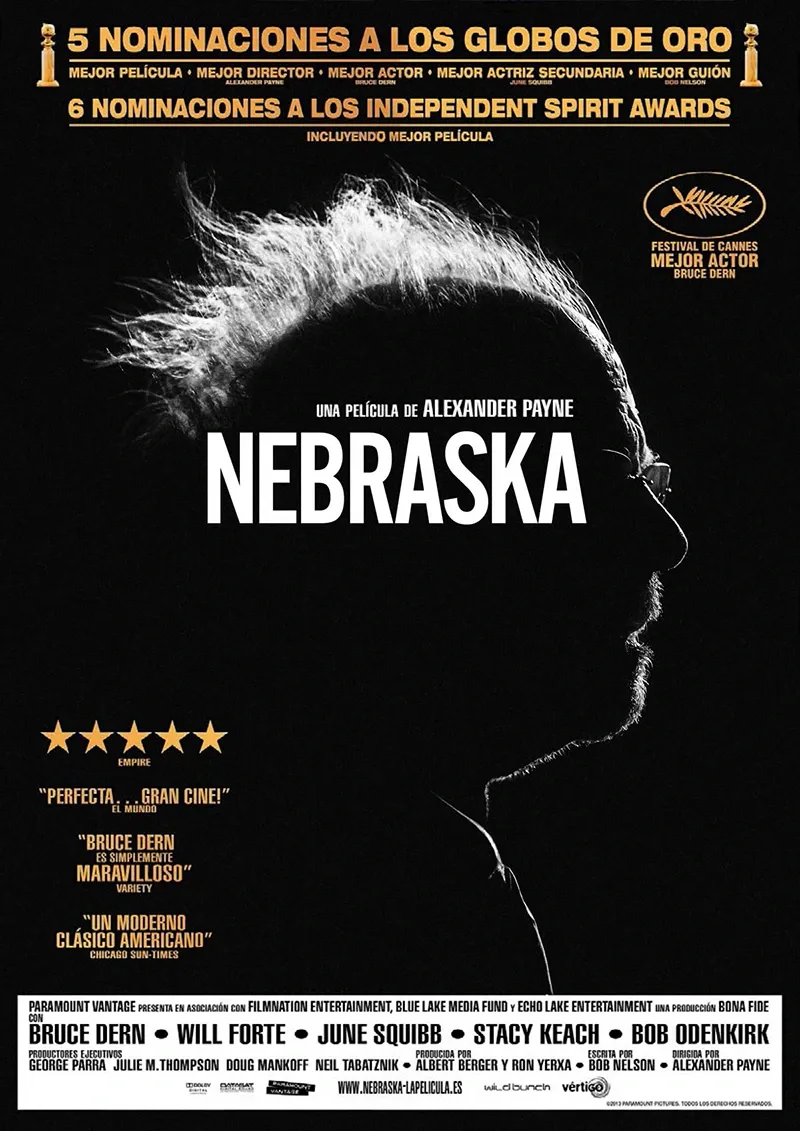
On the movie poster of Nebraska they chose to use different typographies and diverse colors for every message.
Dedication: Multiple revisions. Interlude and peripherical vision. Improvement.
The time needed depends on the brief, source material, complexity and agreed review rounds. Set the schedule from the deliverables rather than assuming one duration fits every poster. Although it’s important to have knowledge on the subject it’s also important to be tenacious and persuasive. We must check and retouch the design of the poster until we are satisfied. The perfection is nearly impossible to achieve but a great dose of dedication assures us, at least, an acceptable level of quality.
But we also must not get stressed. Sometimes we make a job that it doesn’t convince us despite the hours that we have invested on it, but on the next day we watch our piece with another light and the inspiration invades us. A good designer should have a peripherical vision to capture an abstract essence or to change the motif of the design if there’s a better option.
There are no magic formulas but hard work and the passion you put on it ends up to giving a good result.
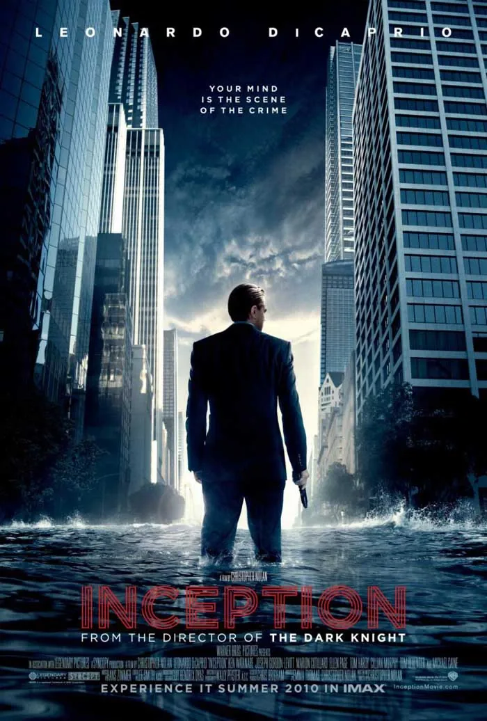
Movie posters such Inception takes a lot of time and will. Designs where you need to have an idea but also where you need to know how to express it.
Be creative and give a personal touch to your design.
Through your creative ability is how you can impregnate your style to the image of the movie. It’s up to you which motif, composition, design and message you are going to use. The creativity is the most valuable ability in the job of any project, and it’s even more important if it’s about a movie poster. The creativity allows us to play with the implicit message of the image in an endless possibilities. We have to connect concepts in a subtle way and with that we have to be able to glimpse something about the movie. We must to use the information of the movie to apply it into a characteristic design.
Thanks to your creativity you’ll be able to make a unique design and you’ll be able to differentiate your ad from any other common design . A poster can influence expectations, but cannot fully control a viewer's response. Explore alternatives and check whether people understand the intended message.
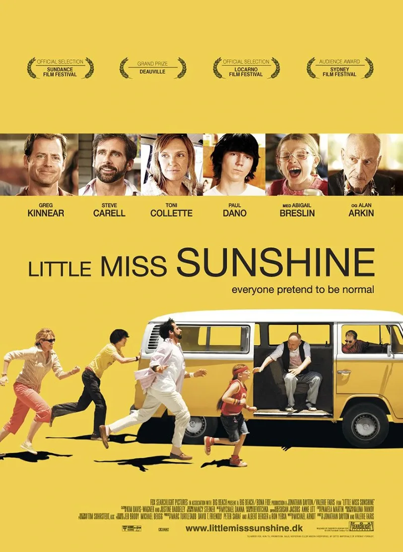
On the movie poster of Little Miss Sunshine they decided to use a topographical creative design in different sizes along with the vintage style of the whole poster, including all the faces of the characters in a horizontal strip.
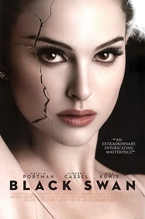
On the movie poster of Black Swan they let free their creativity by capturing the fragility and the fineness of beauty in the porcelain chapped skin of the Natalie Portman’s face. It’s a very striking poster and a clear example of creativity and seduction.
Once again, an example of a good idea is the movie poster of The Imitation Game. The image is the same as the slogan. The man is behind the code, that in this case is the title of the movie. They are simple ideas but they have amazing results.
The movie poster must be an incentive to fulfill its role: To attract.
It’s easy to get lost in a creative sea of ideas, attractive designs and multiple possibilities. But we must not forget the main objective: to advertise the movie, to provide a message and to reach the viewer outside of the screen.
For this is important to wake up that latent motivation that will boost the potential viewer to go to the cinema. Many times, that stimulation plays a huge role on the general framework of the film genre, for example a new terror movie or a new animation movie for kids. But we must not stop here. That’s when we’ll wake up their interest. It’s when the famous AIDA formula appears in the publicity.
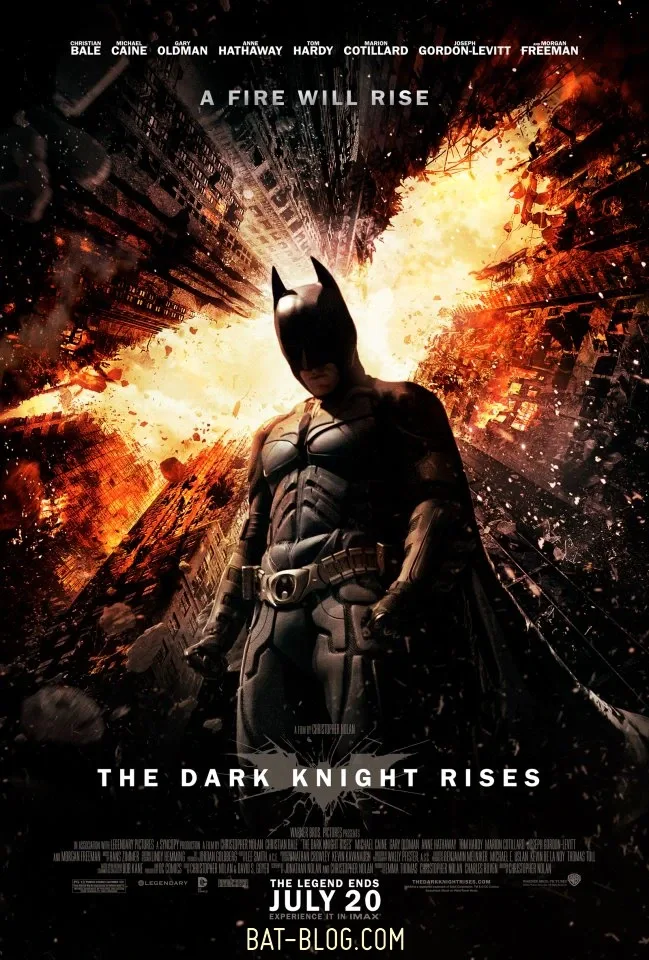
This movie poster is inescapable for the fans of Batman, the movie poster of The Dark Knight.
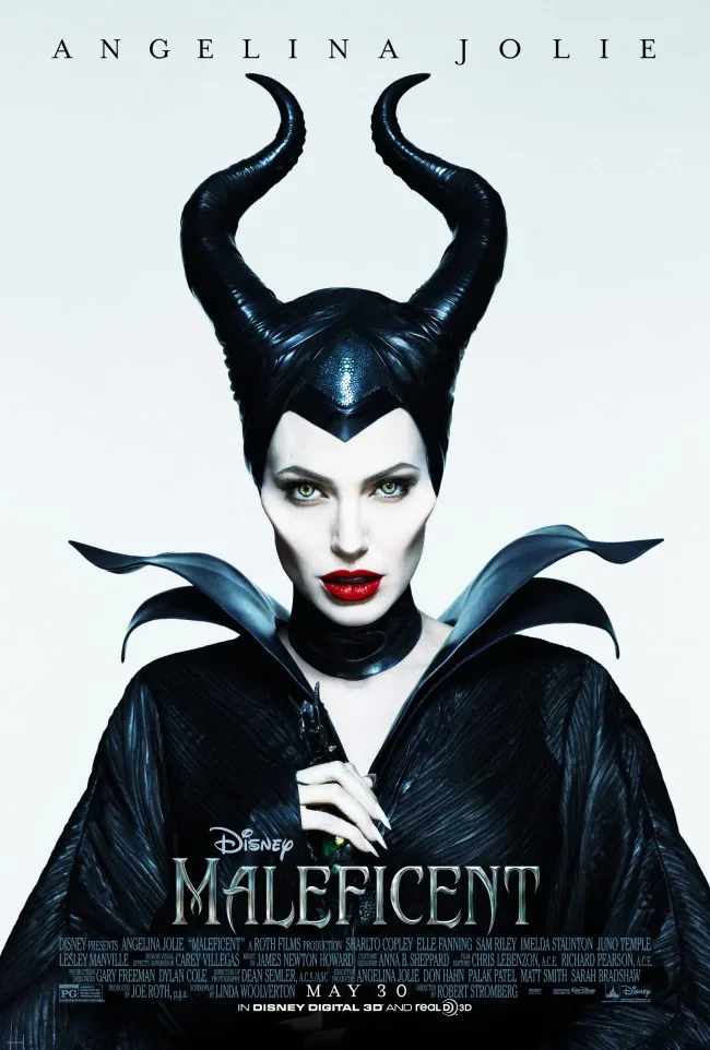
Angelina Jolie is already refreshing herself, but she’s even more refreshing if in the design of the poster it shows the fictional character that she plays. A new facet for the actress and for Disney that they knew how to capture it in a very iconic way. It’s also a perfect example of iconography.
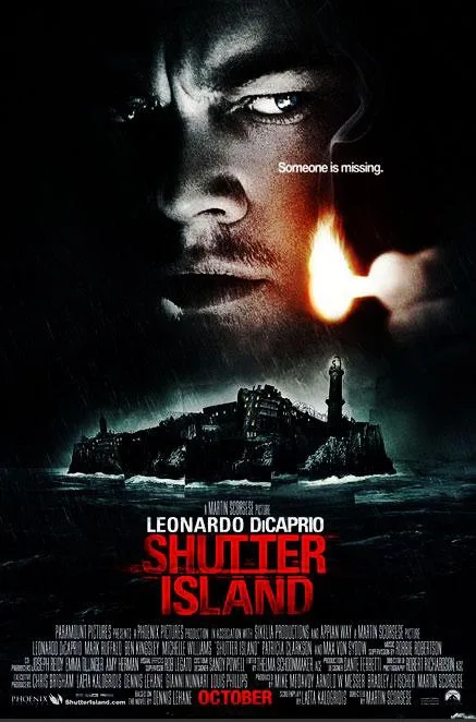
An island, Leonardo DiCaprio, and an ominous design. We need to say no more about the poster for Shutter Island.
Funny things are more likeable
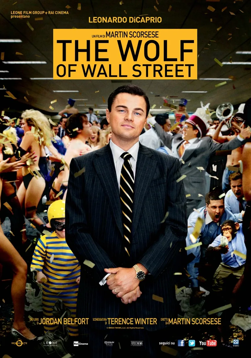
Humor can make a poster approachable when it fits the film. It is a creative option, not a proven sales formula for every campaign. A creative design along with a graceful touch it is more likely to penetrate inside the consumer. A wit that helps to awaken a slight smile in a person, many times as a result of a subtle and known reference, and other times as a result of a little dose of black humor.
The advantage of the art over the science
To design a movie poster or a movie billboard in a attractively, creative and professional way it’s a matter of art and not a matter of science, and therefore, we can’t establish a magical formula to get the perfect result. But without any doubt, it is also a remarkable advantage since it allows you to experience, to let go your imagination and creativity and to find that design that will leave the audience open-mouthed.
And people says… that an image is worth a thousand words, so create a design that will not leave no one indifferent. Catch their attention, arouse their interest, enliven their wish and call them with an unique and creative film design. If you run into any problems to complete your design in a successful way, I can help. I recommend you to take a look at the packages I’ve created especially for movie posters. Good luck with your project!