
The commercial posters or brand marks discussed below are reference examples, not presented as COLONFILM commissions. The commentary describes visual choices rather than measured campaign results.
Designing a movie poster is a sequence of decisions: define the film's promise, gather usable material, choose a visual approach, build the composition, and refine the typography. This guide follows that workflow from an initial brief to a first complete design.
Before opening your design software, write down the genre, intended audience, release context and the one impression a viewer should take away. Gather the approved title, cast credits, usable stills and any required distributor information. A strong image cannot compensate for missing production details.
If you already have a draft, use the movie poster review checklist instead. To compare visual approaches before choosing one, see the five movie poster types.
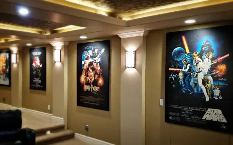
Step One: Capture the motif of the film.
Something essential in designing movie posters is finding the right approach or motif. It is important to find the right way to faithfully represent the essence of the film, taking into account the particular focus we want, and its relationship with the audience for which it is intended. In each film we can choose between different motifs, whether the main theme, the story, its characters, or even the actor if it is highly recognized or if your audience has it in high esteem.In the motive of the film billboard is where the designer has more room to create, attract and give a good reason to those who contemplate the poster to go see the film.
The use of iconography is a very used and minimalistic resource, the iconography used for movie billboards captures in a symbol and a simple but highly visual image, the essence of the film.
Step Two: Gathering resources.
Many resources can help you personify the art of your poster. If you can’t do a professional photo shoot of the characters, you can always use professionally extracted film footage, if you’re looking for a minimalist poster style you can use vector images or illustrations to bring your posters to life. Since posters are generally used in large formats, it is important to use high resolution and good quality images to avoid pixelation when used.Be sure to choose the one that best represents the content of the movie. Identify the emotions and sensations that will experience the public when getting to see the poster of your movie for the first time.
Treat color as a design choice to test against the film and its audience, not a switch that reliably activates one emotion. Colorful? White and black? Chromatic? Based on the contrast? We have to choose. The same personality of the movie will help us with the poster design. We don’t use the same composition in a billboard of a drama than a billboard of a comedy. The color of the poster transmits immediate sensations. Seriousness, passion, calm, intrigue, fun, fear… A palette's effect depends on imagery, contrast, genre conventions and the viewer's context; a color does not carry one guaranteed meaning. Compare palette alternatives with the film's themes and ask viewers what tone they expect before explaining the intended answer.

Step Three: Choose the Design Tool Most Suitable for You.
There are many online tools that allow us to create posters in just a few minutes. I don’t want to delve into them, but in my experience, the results offered are very limited and repetitive, you will find that there are many posters similar to yours and they lack personality. There are better options of software, which, although they require some technical skill, can give us that creative freedom that online editors don’t. My recommendation is to use Photoshop for image editing and Illustrator for graphics or vectors that allow us to work fluidly depending on the type of poster we are creating.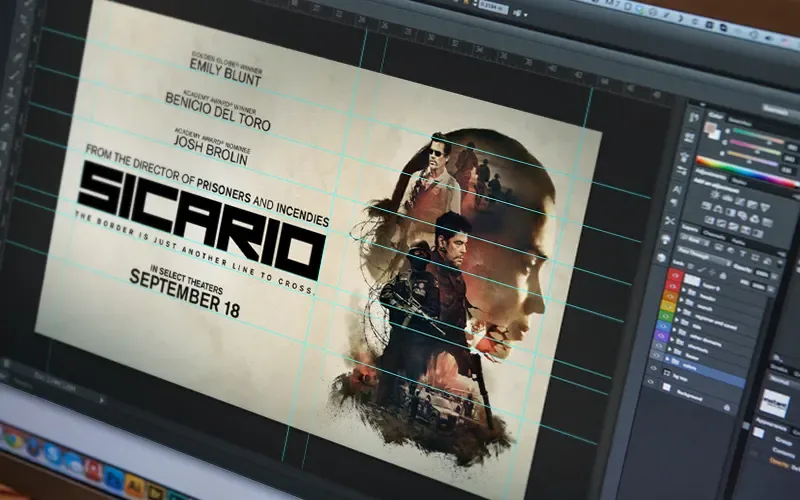
Step Four: Send a clear and communicative message.
A well-designed movie poster should be able to inform and entertain at the same time. Its function is to connect with the audience to which the film is destined, to get their attention, but above all, it must talk about the film. Therefore the future viewer must decide in seconds if it is of interest or not. Within the design of the poster there must be a clear message, easy to perceive for a receptive audience.That is the work of the poster designer. Know what you want to communicate and transmit it through the image, colors and shapes.As there are different types of cinema, there are different types of message. Even the same film could transmit different messages depending on the design we use for your advertising poster.
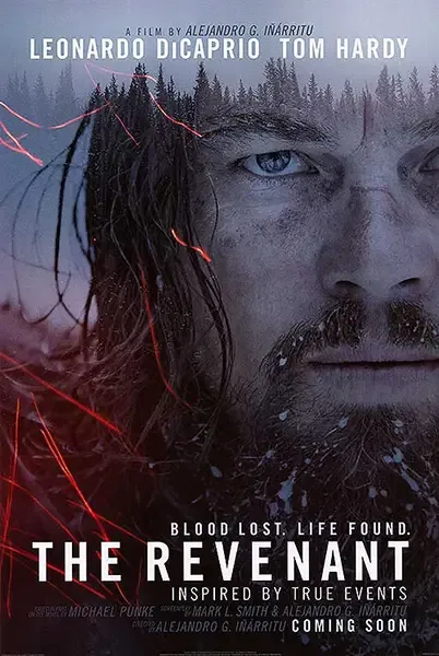 Alejandro G. Iñárritu‘s film, The Revenant, shows cold tones mixed with traces of red, evoking fire, blood in an unforgiving environment. Leonardo Di Caprio’s character has piercing eyes, leaving no doubt we are about to watch a serious movie, overwhelming and full of strong emotions.
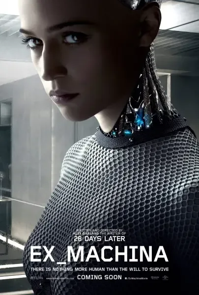 Ex Machina leaves nothing to our imagination, presenting a straight message: mystery, technology, drama, sci-fi. Dark colors and grey scaled tones in the background, makes us feel like we are going to watch cold and mysterious scenes, and judging by the “sexual” nature of the main character, it has a hint of suggestion.
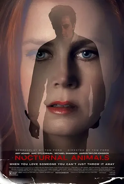 The selection for the movie Nocturnal Animals was simple, overlapping images of main characters, played by Amy Adams and Jake Gyllenhaal. Violet tones and filters applied to the design, gives us the sense of confusion, drama and mystery. Color red adds a “passion element”.
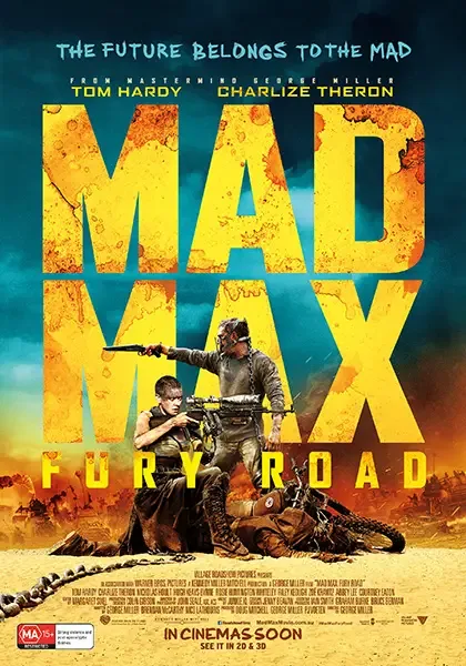 What we got here for the post-apocalyptic film Mad Max, is a high contrast design. Predominant colors? yellows, oranges, browns, to emulate the sterile environment where the plot takes place. It is very clear that the images let us see the fierce struggle that is happening around Charlize Theron and Tom Hardy.
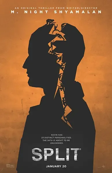 Director M. Night Shyamalan‘s Split shows a poster with a vector based image as main focal point, as we analyze the design, we can observe multiple “personalities” escaping from inside the man’s silhouette. The composition, dark colors and typography, indicates that this is going to be a psychological thriller, suspense, horror movie.
Step Five: The typography.
A typography can express a lot of different emotions, allowing us to combine with the suitable use of colors, to send a specific message. Letterforms can suggest tenderness, tension or period, but the choice depends on the film. Test readability and tone instead of assigning one font category to an entire genre.One technique that is present in many billboards that have been successful is the one to combine diverse typographies. A technique that offers creativity to the message, besides giving a disruptive and very characteristic aspect.
Besides typography, it is also important to think about the amount of text that you will want to include in the movie poster design, starting with the title, tagline and credit block. Everything will depend on the artistic direction you’ve decided to take on your own or with the support of an expert designer. Is worth mentioning that just as there are free fonts on the Internet, there are also licensed for commercial use, so I recommend you pay attention to this detail before commercially distribute your work to avoid legal problems later.
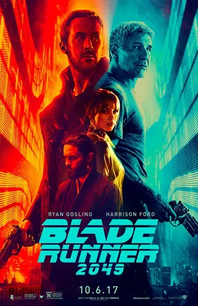 Typography has multiple functions in this particular poster. Blade Runner – 2049 comes from a Harrison Ford’s classic. For that reason, the design kept the same 80’s futuristic typography, a connection can be made that way between the 1982 movie and the current one. Besides, it clearly shows the sci-fi, action and vertigo vibe.
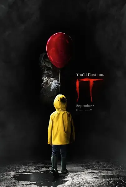 Another classic, but this is time for horror. It delivers a dark and high-contrast poster, red typography that looks like blood, or maybe deflated balloons. It is very obvious that horror and suspense are the main theme in this film.
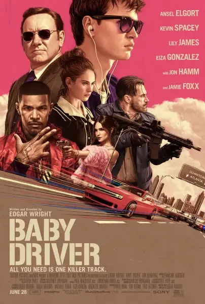 This is an interesting poster. Pink and violet tones are predominant in support of the Baby Driver‘s movie theme. Sans Serif bold typography, is sending a strong message and the main title gives us the impression of a mission that must be accomplished.
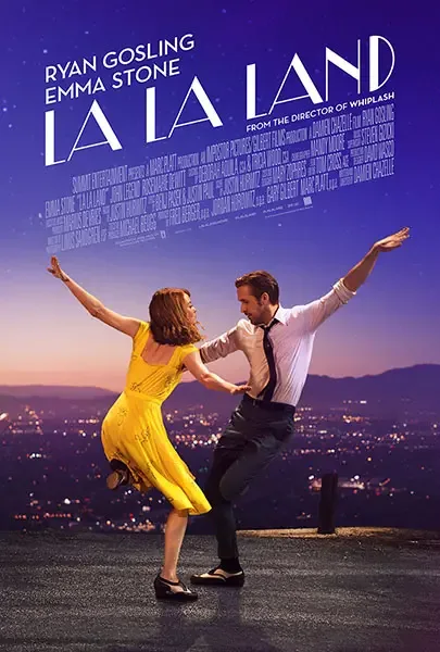 La La Land‘s poster presents the main title with a clean, vintage and inclined typography, which gives us that “singing” or dancing sensation, with a clear old school tendency.
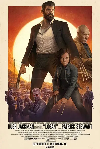 The fact that Logan is a movie based on the future, makes contrast with the “aged” character played by Hugh Jackman. Sans Serif bold typography leaves the focal point to the main design and it is totally inclined to the vintage vibe and classic movie looks.
Designing a movie poster in an attractive, creative and professional way is a matter of art, not science, and therefore we can not create a magic formula (even if we wanted to) to get the perfect result. But this is the advantage that allows you to experiment, unleash your creativity, and look for that design that leaves the audience with open mouth.
The fact that Logan is a movie based on the future, makes contrast with the “aged” character played by Hugh Jackman. Sans Serif bold typography leaves the focal point to the main design and it is totally inclined to the vintage vibe and classic movie looks.
Designing a movie poster in an attractive, creative and professional way is a matter of art, not science, and therefore we can not create a magic formula (even if we wanted to) to get the perfect result. But this is the advantage that allows you to experiment, unleash your creativity, and look for that design that leaves the audience with open mouth.
They say “a picture is worth a thousand words”… So create a design that does not leave anyone different. It captures your attention, awakens your interest, enlivens your desire and calls them to action with a unique and ingenious film design.
If you run into any problems to complete your design in a successful way, I can help. I recommend you to take a look at the packages I’ve created especially for movie poster before you embark on this adventure. I hope you find these tips useful. Good luck with your project.