
A book cover concept becomes useful when you can explain what each choice does: which reader it addresses, what emotion it suggests and what remains readable at thumbnail size. This tutorial works through a concrete example rather than asking you to choose colors and fonts in the abstract.
Our demonstration title is The Light I Choose. The three images below are studio style-selection samples, not a published client case study or evidence of sales performance. They keep the title, a woman and a lighthouse while changing the visual treatment.
1. Write a one-sentence visual brief
For this exercise: “A woman faces a difficult choice beside an isolated coast; the lighthouse is a point of hope.” This is a proposed visual brief for the demonstration, not the synopsis of an actual manuscript. Add the intended readership, the strongest emotion and any elements that must not appear. Do this before collecting imagery: otherwise an attractive picture can quietly become the whole brief.
Use the Cover Design Brief to record the title, author name, comparable books, audience and production needs. For an actual commission, include a synopsis and explain why each reference is relevant. “I like the quiet mood” is more actionable than “make it like this.”
2. Compare three genuinely different treatments
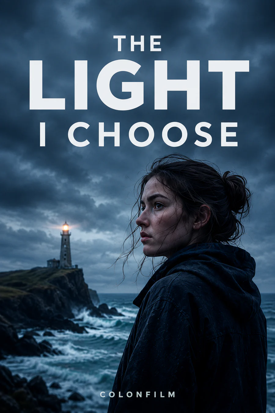
Photographic: the woman's face is the emotional anchor; the lighthouse sits behind her as a smaller point of light. The cold palette and dark clothing suggest a serious atmosphere. This treatment asks the viewer to believe in a scene. In a production cover, check that composited elements agree in perspective, lighting and detail.

Illustrated: the warm sky changes the emotional emphasis without changing the recognizable subject. This version is a useful reminder that “illustrated” is a treatment, not a synonym for one genre. Compare the energy, texture and audience expectations, not just which image is the most colorful.
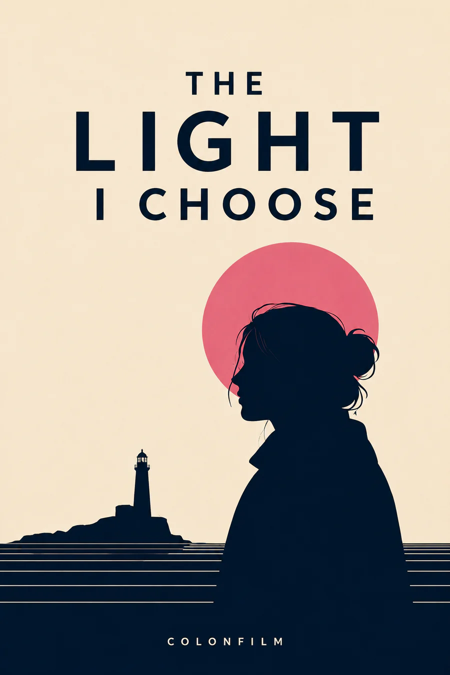
Minimalist: the silhouette, pink circle and lighthouse simplify the visual language. Fewer elements make proportion and placement more exposed: a weak silhouette or an awkward gap cannot hide behind texture. Minimalism is not an automatic shortcut to an easier design.
Choose the direction that matches the book and its intended readers. You can compare the same three options in the book cover style selector. The samples are teaching aids; a real cover should be developed around the actual book.
3. Establish a clear reading order
Write down the order in which the reader should notice the elements. In these samples the title is prominent, followed by the portrait and the smaller lighthouse. A different project may need the author name first, especially for an established series. Avoid making every element equally loud.
Test two or three title arrangements before polishing the background. Look at the longest line, the spacing around letterforms and the relationship between the title and the face. A font that looks impressive at full size may become a pale texture when the cover is reduced.
4. Test the cover where people will see it
Reduce the front cover to a small thumbnail and compare it beside books aimed at the same audience. Ask someone unfamiliar with the project what kind of book they expect and what they notice first. Do not tell them the intended answer. If they misread the mood or cannot find the title, revisit hierarchy or contrast before adding effects.
Also inspect the full-size artwork for masking edges, inconsistent light, accidental tangencies and spelling mistakes. A thumbnail test and a close inspection answer different questions; passing one does not replace the other. Color associations are context-dependent, so use reader feedback rather than treating a palette as a universal genre formula.
5. Separate front-cover approval from print production
An approved front cover is not yet a complete print cover. The back, spine, binding, trim size and final interior page count affect the production file. Paperback and hardcover layouts are not interchangeable, and a new page count can change the spine.
Use the Cover Template Calculator as a planning aid, then check the final file against the printer's current template. For production requirements, consult Amazon KDP's cover calculator or IngramSpark's cover template generator. Keep the provider's instructions with the job rather than relying on a remembered universal measurement.
6. Hand over a decision, not a folder of guesses
Before approving the design, record the selected treatment, final title and author spelling, intended formats, printer specifications, image and font permissions, and the files included in the agreed package. Request any editable source files or marketing adaptations explicitly; they are not implied by the words “cover design.”
- Does the design suggest the right kind of reading experience?
- Is the title legible at the size where readers will discover it?
- Are the final text and visual rights confirmed?
- Has the print layout been checked against the final interior and binding?
- Do both parties know which deliverables and revisions are included?
For a broader overview, read the five-step book cover design process. To evaluate an existing design, use the effective-cover checklist. For commissioning and budget decisions, see our book cover cost breakdown.