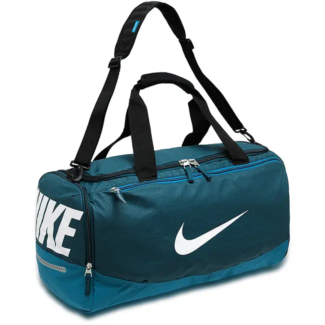
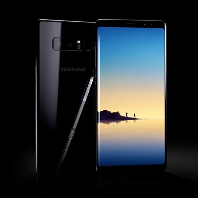
If there is any element or sign that identifies our brand, that is the logo. Now, it is much more than that, it is the way we have to differentiate ourselves from our competitors and the objective is to identify the products or services we provide.
Without going any further, when we see the Ferrari logo, we are not just looking at a brand of cars… But we see high-end sports cars, with a lot of prestige and history and even perhaps many of us begin to imagine situations driving one of them.
This is because the IMAGE of the company is summarized in the LOGO. It is a distinctive that when seen, customers idealize it according to their own experiences and others with the brand.
That is why it is important to create a good logo for your company
Step One: Dive into your company: what do I want to transmit?
The first step to create a logo suitable for your brand is to carry out a study of your own company, and thus you will know that you want to transmit or sell. And for that there’s nothing better than asking yourself a couple of questions:
Why do I want to design this logo? What was I thinking about when I decided to create it?
What are my ideal customers like? What should the logo look like? (formal, informal, serious, funny, academic, etc.)
What do I think are the 3 most important attributes of my company?
What kind of phrases or images might reflect those attributes?
What is the competitive advantage that my company has over the closest competencies?
Do I have any inclination or preference for certain colors?
At the beginning one usually goes crazy because, as we don’t have limited what we want, EVERYTHING could be part of our logo so it’s impossible to think and get ideas, and generally end up coming up with things totally shot and meaningless. Answering these questions, what we do is to limit the scope of possible designs of our logo.
Once you have answered the questionnaire, you will know what your logo’s objective is, what it should look like, the attributes and advantages it should reflect, the images and phrases and which colors would be more appropriate.

Step Two: Rain or brainstorming.
Here comes, perhaps, the funniest moment of the process. Or at least personally, it is. Today everything is valid and we are going to squeeze the maximum out of each one of us so that the best idea comes out. We’re gonna get it with brainstorming.
The purpose here is to write down all your ideas, and by this I mean ALL AND EVERYTHING of the ideas you come up with for the design of our logo. IMPORTANT: These ideas must meet most of the requirements in step 1.
And now it’s time to create a list. We will write down everything that this idea conveys to us, everything is fine, there is nothing wrong, there are no bad ideas, there are no boring words or words that are not worthless. And in this case we will opt for quantity rather than quality.
I’ll give you an example to make it clearer.
If our main idea is a logo that represents something “sweet” in the event that our company is a bakery, the first brainstorming will be basic: cupcakes, donuts, chocolate, milk, strawberries, flour, sugar, love, pink, cream, spongy, colorful, fun; and so on until we exhaust our brainstorming..

Step Three: Let’s choose the type of logo and font.
You’d think there’s only one kind of logo, but no. Let’s look at the different types of logos that exist, so you can see which is the most appropriate.
The Logotype is a logo made only by text, the Isologo is a logo that only uses images, while the Isologotype are logos that mix text with images.
Now let’s give you some advice on how to get your logo to meet its objectives:
It is FUNDAMENTAL that it is adaptable to different formats and designs, we have to think that our logo will be found in many places and mostly all different:
· Company website
· Sending of email marketing messages
· Different types of ads (AdWords, Facebook Ads, etc.)
· Brochures
· Business cards
· Newspapers, magazines, etc.
One point to keep in mind is to design our logo so that it can be seen both horizontally and vertically. And in order to use it in small and large sizes, make it vectorial, this will make it possible to modify the size of the logo without losing quality or the image will pixel.
And what about the choice of source? We’re probably going to look for calligraphic, modern and beautiful looking fonts, but it’s not always the best choice. A good tip is to use an easy-to-read typography, and try not to throw the palette of paintings into it. Using as few colors as possible helps the legibility of our logo.

Step Four: Simplicity above all.
Sometimes we get excited because we want our logo to be stunning and eye-catching, and that makes us end up designing extravagant logos, fancy or confusing, either by the way we choose or the colors we use.
And yes, it may catch your attention the first time someone sees you, and even arouse your curiosity, but the problem is that in the long run it will be hard to remember. This is because of the complexity that it is… and if there is one thing that all successful logos have in common, it is that they are easily recognizable and memorable. Remember, LESS is MORE.
What if I realize that my idea has already been used in another logo?
There are hundreds of thousands of companies all over the world, and therefore hundreds of thousands of logos, it is very likely that some of the ideas, images or phrases you will come up with already exist or have been used before.
Don’t worry, you don’t need to change your idea completely, but you can personalize it to make it unique… a clear example of this is the Apple logo and its apple with a bite.
Follow this advice: use original images and phrases that aren’t too trite. If you use a figurative image, be sure to give it a distinctive touch, something that can set it apart from the rest.
Step five: Time to draw our logo!
First we’re going to retrieve the word selection from our brainstorming. I’m sure great concepts came out if you’ve followed all the steps correctly. Now let’s turn words into images, with ideas already in our heads, time to grab pencil and paper and draw them.
Yes, I already know… You don’t know how to draw!
But it doesn’t matter, every creative process takes time and requires effort, technique and knowledge. If you encounter any problems completing the design successfully, I can help you. I recommend that you fill out the design application form to learn more about your logo and be able to advise you before you embark on this adventure. I hope you find these tips interesting. Good luck with your project!.

