Despite the famous phrase “We should not judge a book by its cover”, in most cases, potential customers don’t follow this recommendation. Books with a good image, striking typography and, ultimately, quality design, sell more copies. That’s a fact.

Although some people think, books are not in decline, the digital format is constantly growing and platforms such as Kindle, of the giant Amazon, are generating huge revenues thanks to writers who sell their books through them. And of course, one of the most important aspects to stand out among many competing writers’ work, it’s the cover.

I’m a designer specialized in book covers and movie posters and I want to help you in the creation process with some basic guidelines that I’ve learned over the years. Whether we’re talking about a printed book or an ebook, in this article I will show you the most important steps you need to keep in mind when creating your cover. Let’s start.

Step One: Research.

Each designer has his own method, but this is something you can start doing long before publishing your book. Take photos, take screenshots of the font you like, find colors and patterns that are related to the content of the book, and organize them into common themes. Look for books of the same genre and extract the best ideas that would make you buy that book.

There has to be some consistency between the cover and the content of your work, without forgetting creativity. The covers of fiction use the emotions generated by the plot, such as surprise, curiosity, fear, intrigue, etc. through the elements of the design. While the nonfiction covers opt for providing images of great impact, causing the mood that seeks the reader. All with one intention: to catch the attention of the public, refer to their emotions and feelings, help them make a decision.

Step Two: Measures and Format of Your Book.

This step is short to explain, but no less important. Before designing starts, we must be sure of our book dimensions and the format needed to publish it and/or print it. Each website has different requirements that must be taken into account, although we can always relocate the items later for different editions. Tip: Always make sure to save the editable file.

Step Three: Choose the Design Tool Most Suitable for You.
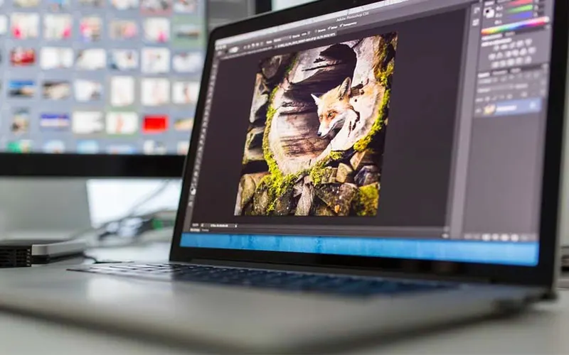
There are many online tools that allow us to create covers in just a few minutes. I don’t want to delve into them, but in my experience, the results offered are very limited and repetitive, you will find that there are many covers similar to yours and they lack personality. There are better options of software, which, although they require some technical skill, can give us that creative freedom that online editors don’t. My recommendation is to use Photoshop for image editing and Illustrator for graphics or vectors that allow us to work fluidly depending on the type of cover we are creating.

Step Four: Selection of the Main Image.

A graph, a graph with the title, a background, a powerful image, a minimalist image, a collage. There are many options available, and for the same book, it can be handled several designs that would work properly. Be sure to choose the one that best represents the content of your work without losing the essence that identifies you as author. Either if you are an experienced writer, or if you are becoming one, create an image that identifies you among all the other writers, is one of the best decisions you can make. Just remember, the purpose of the cover is to attract your readers, that’s why I recommend to avoid including personal photos, with the exception of autobiographical books or if you are a renowned author and your image will generate a large number of sales.

Identify the emotions and sensations that will experience the readers when getting in touch with the cover of your book for the first time. Use color psychology to activate particular emotions or feelings. For example, orange transmits energy; blue, serenity, purple inspires respect, with a simple search on google you can find great contributions that will make the design be much closer to your readers. I recommend you thoroughly to study this issue, it will be one of the determining factors of the artistic direction of your design and most importantly, will contribute positively to the success of sales.

There are many sites available to get an image for your cover. Quality images often have a price, and you should make sure you get the distribution rights to acquire them, in order to avoid inconveniences with the owners of the images. If you want to sell your book, forget to include unlicensed google images, of which you are not sure of its origin. “Better preventing than regretting” they say.

In Semih Caliskan’s Bir Bar Filozofu, we can see an excellent composition of suggestive images predominating over typography, with a lot of contrast between black and white, light and darkness, mixed feelings, secrecy.
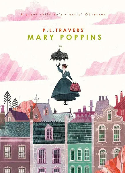
P.L. Travers chose a nice illustration for her book Mary Poppins. The medium and light tones give us a sense of freshness, typical of a work directed to all age groups, especially to children. The title in a sans serif font, for simplicity and readability.
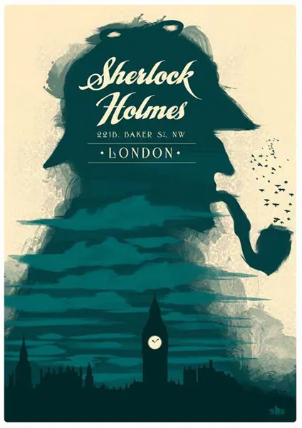
This cover for the book Sherlock Holmes gives us the look and feel of a mysterious and dark atmosphere, using black and dark bluish green tones, proper colors of heaviness or darkness. It includes iconic illustrations of the streets of London and the peculiar character of the pipe in a foggy style for more drama. The title in a modern handwritten font with a lot of style.
In this edition of Cinderella by Charles Perrault, the title is presented in a Serif type font with classic look, plus earthy tones in the background giving the feeling of old or worn and a smooth transition from the broom to pink dress that’s very striking, expressing the dramatic change that gives the character in the story.
I just wanted to show you a little more, in the book ¡Adelgaza! (Lose Weight!), we can see a living example of strong elements like the energizing, positive and happy bright yellow, in combination with a “thin” green apple, symbolizing healthy and organic. Another element we should look at, is the typography, Sans Serif font, legible in bright pink. That way we can tell this book is intended for mainly female readers.

Step Five:  The typography.

The font is one of the cover’s elements that transmits a lot, in many cases, more than the image. Each element of the composition should be combined with the previous one and together, they will help you make the perfect cover for your book. A typography can express a lot of different emotions, allowing us to combine with the suitable use of colors, to send a specific message. In many book cover designs, the image is omitted to enhance the role of fonts. It is a matter of dedication, artistic vision and having the knowledge to use the correct font in each case. I refer you to the first step, where I recommended to extract ideas from other books that are similar to yours, because a bad decision in choosing the font can confuse the reader and is a difficult science to explain in an article of this nature.

Besides typography, it is also important to think about the amount of text that you will want to include in the cover design, starting with the title. Perhaps you’re thinking to express so much with the title of your work, so I suggest the following: In some cases, a very long title makes the reader lose interest, so, a balanced combination of items such as picture and background to create a atmosphere that will make the reader know what the book is about, will be very helpful. Otherwise, with a very short title we can rely on hook phrases or leitmotiv to cause the reader’s curiosity. Everything will depend on the artistic direction you’ve decided to take on your own or with the support of an expert designer.

Is worth mentioning that just as there are free fonts on the Internet, there are also licensed for commercial use, so I recommend you pay attention to this detail before commercially distribute your work to avoid legal problems later.

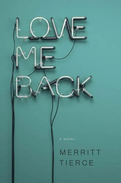
In the novel Love Me Back by Merritt Tierce we found something very interesting, a background of solid blue-green to a sense of reflection or sadness, which highlights the title of the work presented in the form of neon lights. Can you imagine those lights on? It would be the perfect love proposal!
Impossible Modernism presents an edition where all the bets are on an uppercase Sans Serif typography, which is associated to modern and strong statements, and are also disposed in a very artistic way, with a very attractive 2D effect.
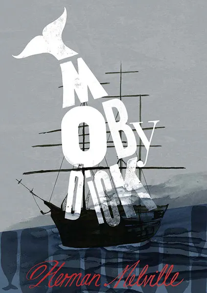
The use of dark sea tones, prepares us for a dangerous adventure on high seas, and as the protagonist, a giant white whale formed by an irregular font, characteristic of madness, irreverence and chaos. Very well made this cover of the classic Moby Dick.
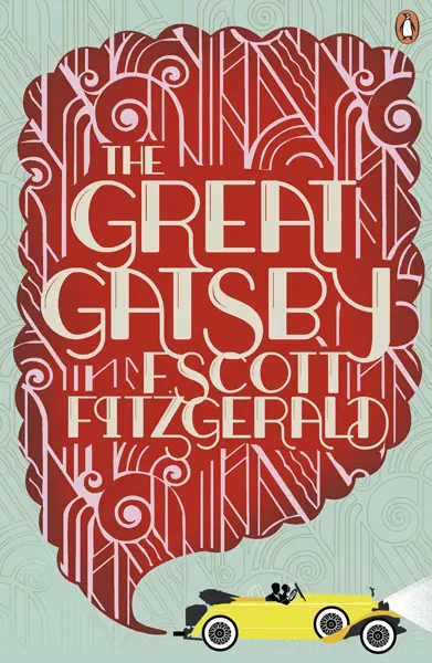
Let’s pay attention to this cover of The Great Gatsby, we note the role of typography, which in this case is vintage or old, red background, adventure, passion, danger. It gives us a clear idea of what we will find when reading it, not to mention the old car that is unmistakable!
There is a mystery behind The Picture of Dorian Gray, which is why this dark, suggestive, majestic, secret purple was used. Typography is classic and antique cut, complemented by a very striking illustrated frame. Excellent.
The cover of your book is the result of all the work you have done to get here. It can be responsible for your success as well as your failure. The creative process requires effort and some technical knowledge. If you run into any problems to complete your design in a successful way, I can help. I recommend you to take a look at the packages I’ve created especially for book covers before you embark on this adventure. I hope you find these tips useful. Good luck with your project.

Need help with your book cover?