There are many ways to design a movie poster, but putting together a piece that captures the essence of the film while attracting the audience and mainstream media is what matters the most. When we look at some posters we immediately think they are unique, but when we zoom in, we’ll start to notice interesting styles and patterns that are worth analyzing.
Therefore, if we are looking for our design to stand from the crowd, we must pay close attention to the aforementioned styles and patterns, their characteristics and their relationship with the movie genere. Now without further ado, let’s start with the analysis of the 5 most common types of movie posters!
The Hero
This is one of the most common types of poster, and as the title points out, the main element here is an image of the leading character or hero, showcasing their attributes, abilities, their relationship with the movie, their personality, and so on. This type of design works really well when this character is well known, famous, no matter if it’s fictional, historic or interpreted by a seasoned actress/actor.
We can use this type of design to highlight an unique and colorful hero as well. A leading character power-couple can fit into this category too.
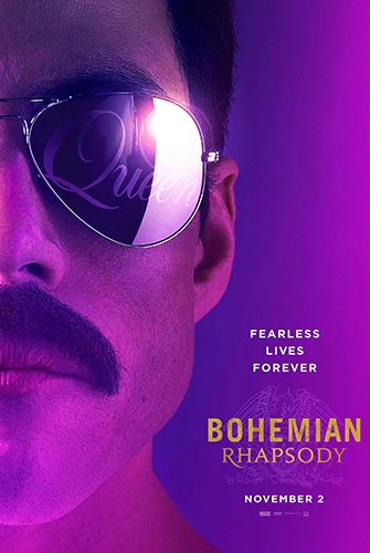
A glorious moustache and a fierce jaw line. Neon lights of purple and pink: Showbusiness and rock & roll. Need we say more? Bohemian Rhapsody, the life and struggle of one of the most iconic rock singers of all time, Freddy Mercury.
The elements mentioned above are hard to miss, and they’re making a statement: Rockstar! That’s the movie you’re about to watch.
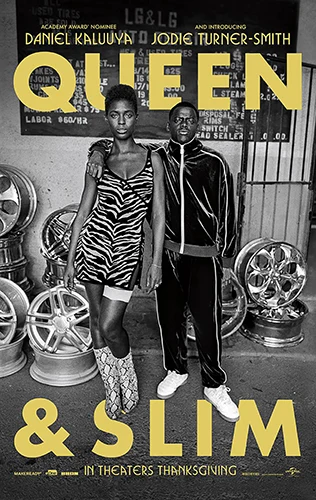
Let’s see, this is a movie we haven’t watched but it’s in our radar. Two believable characters, a garage, and come on, Queen & Slim? two awesome nicknames! Beautiful use of black and whites and the light yellow typography. This is the life, “real life” of urban characters. Straight forward and life-like. Can’t wait to watch it!
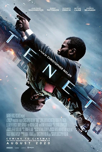
A modern and nice example of the hero. Tenet, the same protagonist in two different situations that look the same, strangeness, the world upside down. Judging by the poster, this is a psychological and action packed film. Prepare your mind to be blown away!
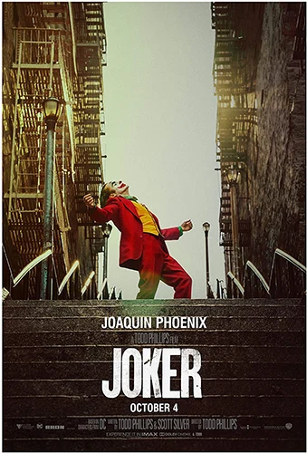
Craziness unleashed: The Joker. A middle aged man, dressed like a wicked clown, dancing freely in the middle of an staircase alleyway. Everything is so neutral and almost greyish around him and his colorful outfit. He is the center piece, this is his story.
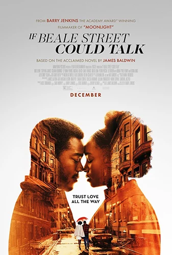
We haven’t watched this movie yet, but we can talk about the clever and beautiful composition, including this couple of protagonists and the melancholic brownish yellow streets of Beale Street, like if those streets lived inside of them.
If those streets could talk! We’d bet they would tell a heart-touching and relatable love story. Not to mention the detail some could miss, the light grey gradient. There is some sadness there too.
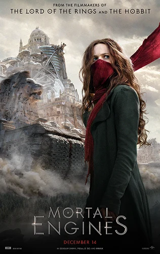
An ominous machine in front of a city or kingdom, plus a shady but colorful protagonist. She’s about to fight and never look back! The grey tones of the background and her red mask/scarf shows us we are about to dive into a fantasy, chaotic and post-apocalyptic story. A perfect depiction of the title: Mortal Engines.
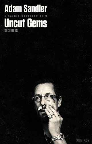
A serious movie from Adam Sandler, we can already tell by looking at this poster: Uncut Gems, raw, dark, dangerous, suffering, pain. Black and white, mystery, something shady is going on.
The Antagonists
This is very similar to the previous one, but this time we will find the two parts that are clashing in the film, the hero and the villain, the protagonist and the antagonist. This style is very useful when the plot indicates a strong struggle between two forces.
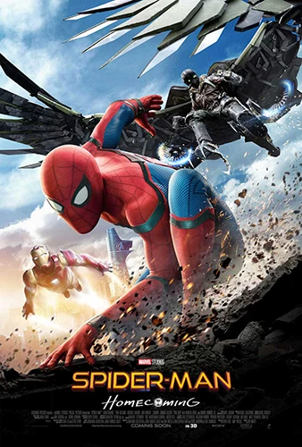
Yes, a superhero movie: Spiderman Homecoming, depicting his two main antagonists throughout the whole film. Mr. Stark pushing him to be the hero he can be, and the Vulture messing around and wanting to eliminate him. Two sides of his life running and trying to catch him. Classic vibrant hero movie colors.
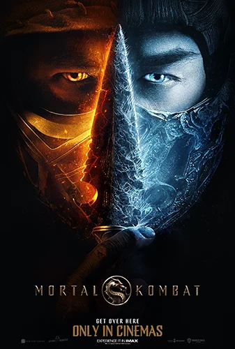
Scorpion and Sub-Zero facing a deadly fight in Mortal Kombat. This is a creative way of depict two confronting forces, each one identified by contrasting colors: fire, energy and gold yellow against the cold ice blue.
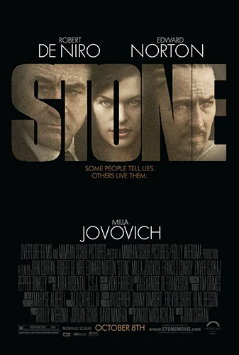
In Stone’s movie poster we can feel trapped and tense with the main characters and antagonists contained inside the main title, surrounded of black color.
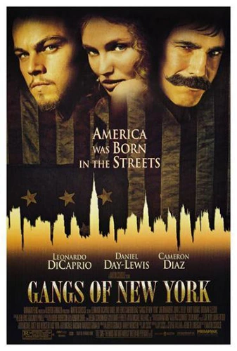
A modern classic, Gangs of New York, also took advantage of this design style. A protagonist couple and their antagonist, showing their personalities through their pictures. The silhouette of New York city and yellow tones to set the “old times” vibe.
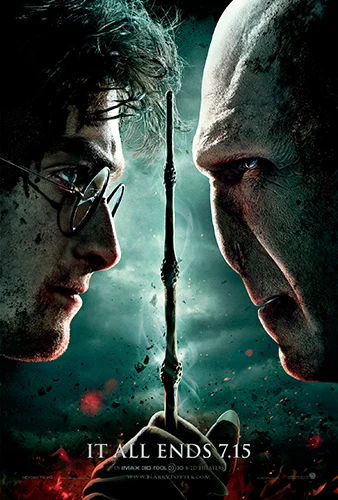
Another modern classic: Harry Potter and the Deathly Hallows, chose a fierce portrait of the two main antagonists. We must say, this is an effective resource when you need to depict a mortal enemy status, an epic fight that is about to develop.
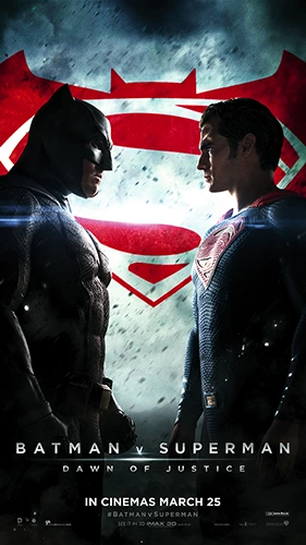
Same happened here with Batman vs Superman. Two well known comic book and live action film heroes, clashing over a misdirected animosity and an even bigger misunderstanding. Dark, strong, sad and epic, that’s what we see with the use of shadows and dark blue. Not to mention the background combined logo in red, representing flesh and blood.
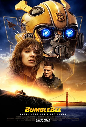
This is another example of a couple of friends, the girl and Bumblebee, versus the military man that’s about to hunt them down. We see a bond between alien and human, struggle and preoccupation from the girl. Nice touch giving us a hint on one of the locations where this film is going to unfold: San Francisco.
Screenshot Or Capture
Another commonly used style or pattern, specially when the movie has a realistic vibe. So, when using a capture or screenshot from the original footage, a real life-like sensation or a dramatic effect can be perceived. The Documentary genere takes advantage of this technique very often.
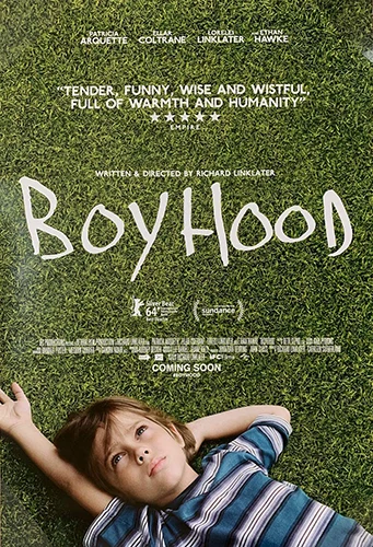
A simple picture that captures the main theme of the film Boyhood. A little boy, thinking and looking at the sky. As we mentioned earlier, this design style gets us really close to real life, no exaggerated special effects.
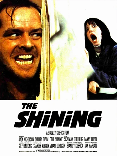
A suspense/horror film classic: The Shining. As you can see, they opted for an unsettling shot of Jack Nicholson in one iconic scene, while stalking Shelley Duvall. This screams psycho, crazy, killer and fear.
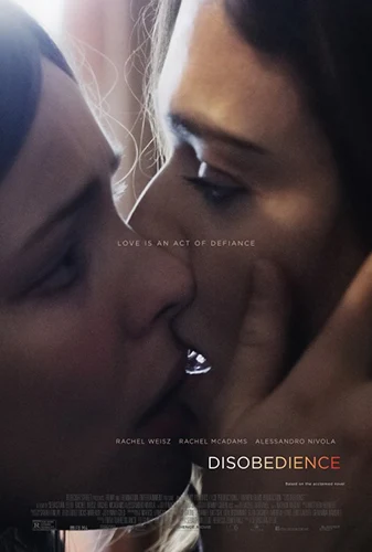
A controversial picture of an almost forbidden kiss between the two leading female protagonists. Disobedience, without watching the film, we know we will dive deep into drama and strong emotions. Nice shot!
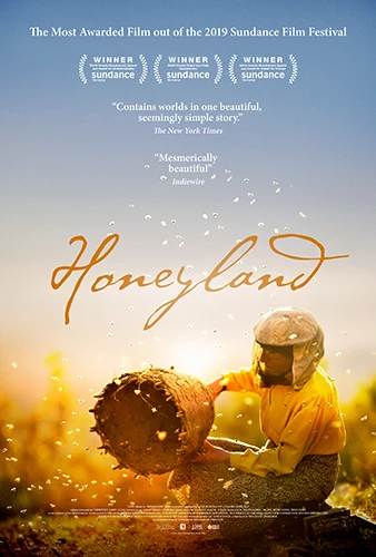
The dramatic story of a female beekeeper took advantage of this enhanced shot of the character, giving no place for guessing about what’s the plot of this movie, Honeyland. Great use of yellows, capturing two things: a sense of melancholy and the color of bees and beehives.
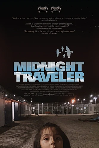
A dark shot inside a refugee camp or some sort of jail, including the face of a little girl, we already know we are going to watch a sad, raw and real life-like film.
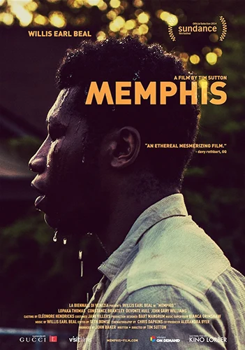
We sense struggle with this nice shot for the movie poster of the film Memphis. Nice cold colors, a little sadness, a little relief. Strong image.
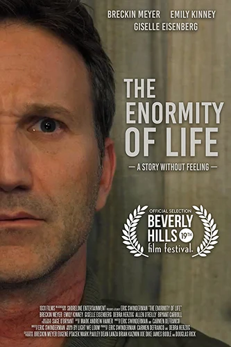
There’s a challenge ahead, the character feels against the wall but yet this will be a real life-like film. A simple shot of the protagonist’s face tells it everything.
The Cast Collage
An extension from “the hero” and “the antagonists”, which includes almost if not all the cast of the film, main protagonists and antagonists. This type of design is very attractive and shows the central idea of the movie in a creative way. The epic plots and big productions often benefit from this style or pattern.

We haven’t seen Beach Bum yet, but it looks like psychedelic fun! The whole cast, bright colors, and references to maybe recreational substances, this movie will get quirky and wild in no time.
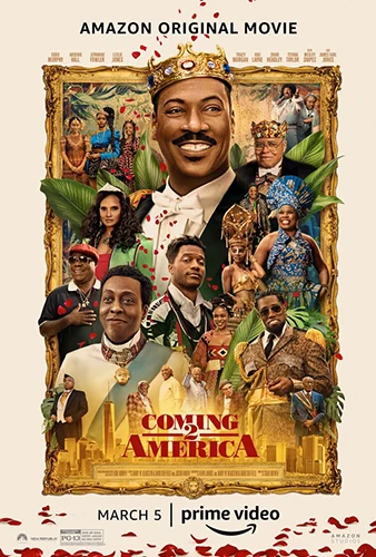
We weren’t expecting a sequel from the 1988 film Coming 2 America. What was expected indeed was the Africa themed imagery and characters, the gold colors of royalty, and references to New York. This is a crowded design, but we think they pulled it off.
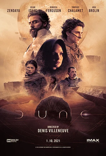
A remake of the 1984 film Dune, brings us a poster design with all the right elements: from the dusty colors and desert environment, to a big finish with pictures of the cast showcasing their personality.
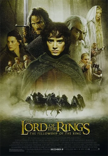
A classic poster that shows us this style of design has been around for years: Lord Of The Rings, The Fellowship of the Ring. A mystical blend of images, colors and mystery, we were ready for an epic adventure with amazing looking characters.
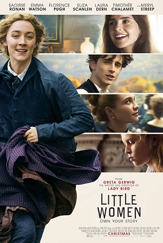
This is one of the many ways we can lay out a cast collage and make it different. Besides, this decision in design went very well with the theme of the movie. Sober colors, high contrast and character personality display.

This 2019 film, Once Upon A Time In Hollywood, took advantage of two styles: the cast collage and a retro vibe since the movie is set in the late sixties. The result is a “sketched-like” photography collage with most of the cast, and depicting situations that we might see happening while watching the movie. Nice poster.
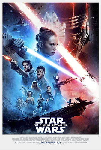
The Force and the Dark Side confront again in “Star Wars, The Rise Of Skywalker”. The main characters get to use a given space, in order of importance, we dare to say. If we keep analyzing, we can see two predominant colors: blue, representing The Force, and red for the Dark Side. A foreshadowing fight scene is represented at the bottom, almost unseen.
The Landscape, Background Or Allusive Image
As you can already imagine, we are talking about a poster design that doesn’t include specific characters, but a beautiful landscape, a futuristic vision or maybe a post apocalyptic panorama instead. It can be a montage or allusive image aligned with the film’s main plot, decorated with logos, symbols or typography. We could be talking about “minimalist trends” to be included into this category as well. This design type can cover a wide range of topics, as long as it keeps “playing” with the psychological aspect of the film in question.
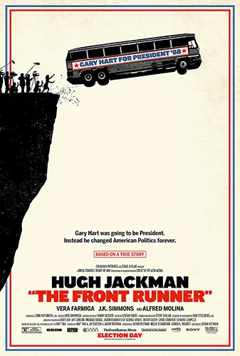
Another movie set in the past, The Front Runner, is using a minimalist illustration for its poster. We know we will watch a film based on a true story, a presidential campaign under the spotlight and a big challenge ahead. And of course, it was a very clever use of reds, white and blue, very patriotic.
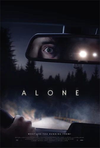
Speaking of psychological impact, a dark road across the woods and a nervous person being followed by an unknown vehicle: Alone, a film we haven’t watched but already creeped us out!
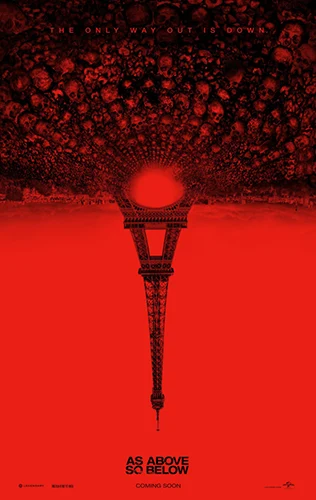
As Above So Below shows us a very red poster, giving the sense of blood, intensity, sickness, death. The pile os skulls “under” France makes us believe there are as much dead bodies below as living people below. Or viceversa, very clever use of psychology here.
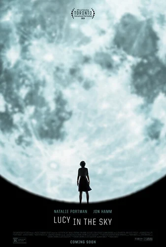
Lucy In The Sky has a simple but beautiful poster. We assume the person depicted here is Lucy, and she’s lost in space, or earth, or both. Very intriguing and a nice play of black and white, the moon and typography.
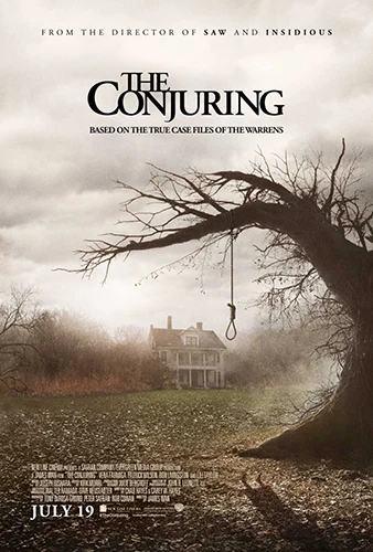
This is a perfect example of this “image-only” style, no characters, no recognizable faces. We have an ominous landscape instead, with a gallow rope that projects an interesting shadow of a hanging person, we didn’t catch that detail years ago! Creepy, mysterious, fantastic.
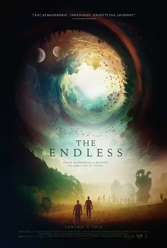
We haven’t seen The Endless, but this film is promising science fiction, multi-dimensions and mystery. Again, just a very nice design without characters or faces, but an interesting use of dark colors on the outside, and “spacey”, “heavenly” tones on a tornado of worlds.

In the poster of Vice, we get a big face, but we cannot distinguish who is he. It’s minimalist approach with white, black and yellow gives us nothing on the movie, just an “stoic” silhouette of a man. Maybe the movie is serious? We have to watch it.
Conclusion
We have done a little countdown of the styles or patterns that commonly emerge at the time of designing a movie poster and it’s worth mention that creatives have been using some of them since the beginning of advertising related to film making. As graphic design professionals we always look for the most suitable artistic vision for our client’s projects, and we make sure it encloses the essence of the film genere that is assigned to us. If you are struggling with the decision of which way to go artistically, need assistance or better, to turn your poster into a piece of art, please do not hesitate to contact us. We will be glad to help you.

